Selecting the right tool for data visualization can have a significant impact on the effectiveness of insights being shared, especially given the explosive expansion of data-driven decision-making. It is crucial for professionals to select the appropriate data visualization tool since it enables them to use analytics, enhance understanding, and provide more strategic results. The top data visualization tools are known for their ability to clearly illustrate patterns, trends, and opportunities while also simplifying complicated datasets.
Table of Contents
What is Data Visualization?
The art of data visualization involves transforming complex data into understandable and significant graphics that efficiently expose insights and simplify decision-making. Since businesses are producing massive amounts of data every day, it is now essential to move away from static spreadsheets and toward interactive dashboards and reports to notice patterns, discover errors, and make well-informed decisions. As data visualization keeps developing, companies depend more and more on advanced tools that not only present data in an eye-catching manner but also turn unprocessed data into narratives that draw attention to opportunities and hazards.
Top 8 tools of Data Visualization
The top 8 data visualization tools are essential for deciphering complicated datasets and transforming them into insights that can be put to use. The rich, interactive dashboards of Tableau and Microsoft Power BI are well known, but QlikView is distinguished by its powerful associative analytics.A free cloud-based solution that integrates easily with Google services is provided by Google Data Studio (formerly Looker Studio), while D3.js offers developers and customization enthusiasts unmatched flexibility.
Domo is a leader in providing businesses with real-time business intelligence,while Plotly allows interactive visualizations, including Python, R, and JavaScript. Chart.js offers a lightweight solution for straightforward but powerful online charts, and . When used together, these tools enable businesses to evaluate, understand, and display data in ways that improve corporate expansion and decision-making.
Tableau
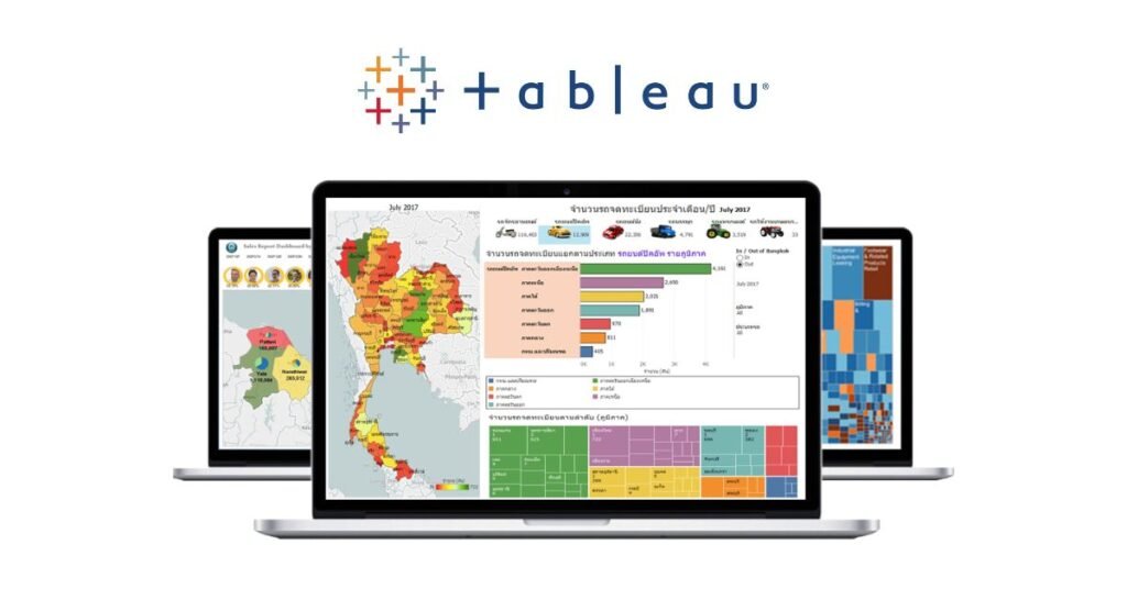
One of the most popular and powerful data visualization tools is Tableau, which is known for its ease of use with large and complicated datasets. Without requiring much technical knowledge, users can easily create dynamic reports and interactive dashboards with its user-friendly drag-and-drop interface. With Tableau’s support for real-time data analysis, users may rapidly produce insights by connecting to different data sources. It is a top option for data scientists, business analysts, and companies seeking to obtain a competitive edge through data-driven decision-making because of its advanced features, which include predictive analytics and mapping capabilities.Businesses utilize Tableau’s data visualization feature extensively to improve data storytelling and accelerate decision-making.
Microsoft Power BI
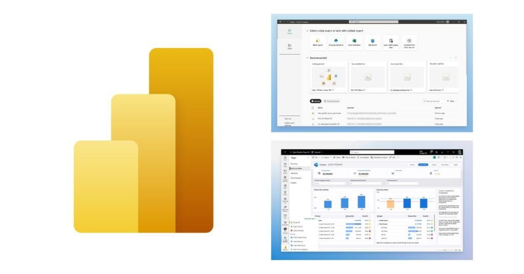
A powerful business intelligence and data visualization tool, Microsoft Power BI enables enterprises to transform unstructured data into insights that can be put to use. It is a logical choice for businesses that currently depend on Microsoft products because of its smooth integration throughout the Microsoft ecosystem, which includes easy connections with programs like Excel, Azure, and Microsoft Teams. Real-time data exploration and analysis are made possible by Power BI’s dynamic dashboards and fully customizable reports.
Both technical and non-technical users may easily acquire insights because to its AI-driven features, which simplify difficult data interpretation through analytical forecasting and natural language queries.Businesses of all sizes can efficiently manage and share data with Power BI’s strong data protection, scalability, and cloud-based collaboration features. Power BI stands out as a top option for businesses looking for advanced data visualization and intelligent decision-making at scale because of its enterprise-ready features and affordable price structure.
Qlik view
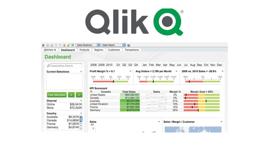
To assist businesses in understanding and analyzing data from many sources, Qlik created QlikView, an effective data discovery and business intelligence tool. Because QlikView uses in-memory processing, users can examine data more quickly and effectively than with traditional BI solutions. It offers an associative data framework that lets users freely investigate connections between datasets to find previously undiscovered information. QlikView is a popular choice for businesses with complex reporting requirements because it offers strong data integration capabilities, dynamic dashboards, and powerful analytics. Its enterprise appeal is further enhanced by customization choices, scalability, and security features. QlikView is still commonly used for guided analytics and highly structured reporting in data-intensive businesses, while its modern comparable, Qlik Sense, focuses on self-service visualization.
Google Data Studio
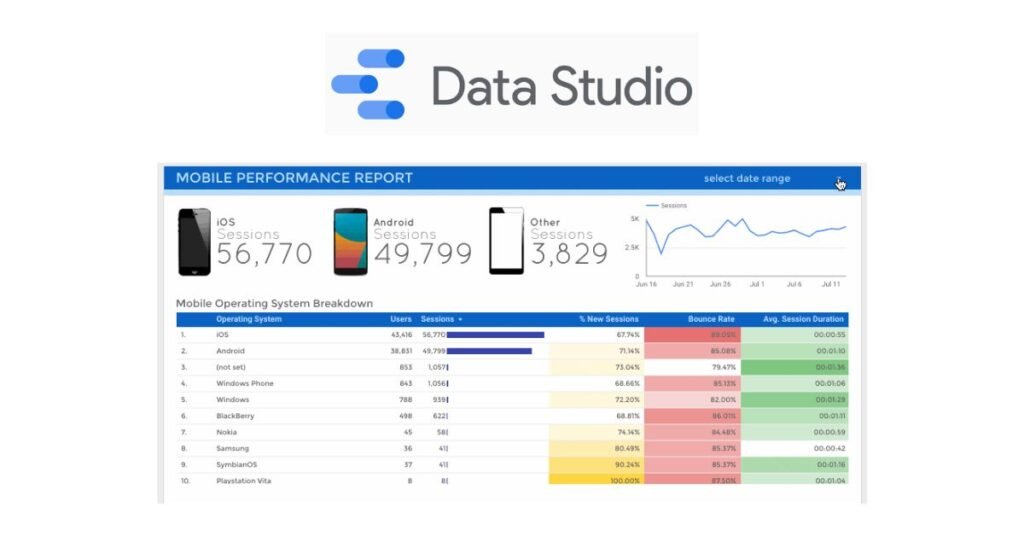
A free cloud-based application for data visualization, Google Data Studio facilitates easy and cooperative reporting and analysis. Its smooth integration with Google services, including BigQuery, Google Analytics, and Google Ads, makes it particularly useful for digital analysts, marketers, and SEO experts. Users can create customized reports and interactive dashboards that clearly and engagingly display complex data. It enables real-time collaboration, enabling teams or clients to modify and evaluate dashboards at the same time, just like other Google Workspace apps. It is one of the most useful tools for businesses looking for efficient, user-friendly data visualization and reporting solutions because of its simplicity, accessibility, and free availability, even though it lacks some of the more advanced analytics of commercial platforms.
D3.js (Data – Driven documents)
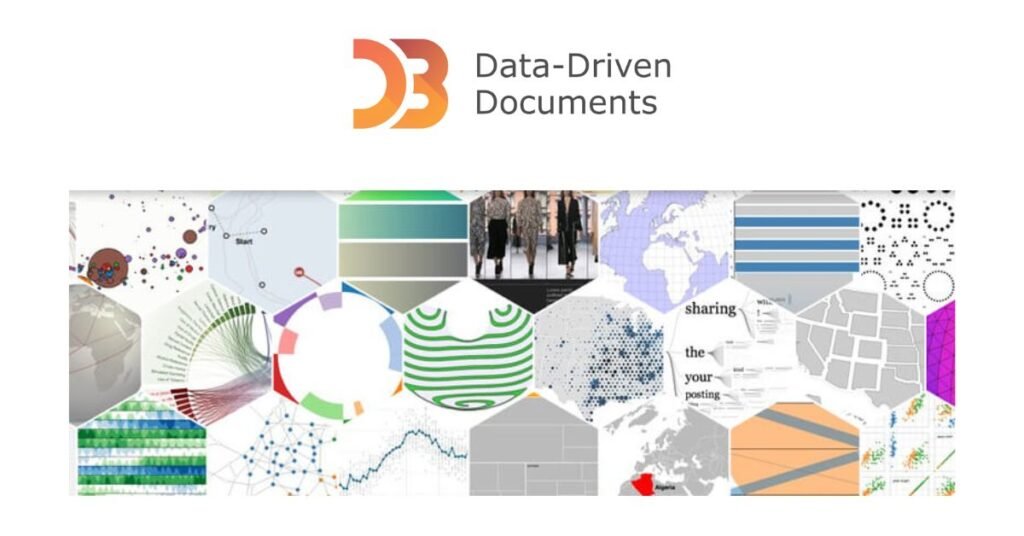
D3.js (Data – Driven documents) is a powerful open-source JavaScript toolkit that enables the creation of dynamic, interactive, and highly customized data visualizations right within web browsers. Developers may connect data to HTML, SVG, and CSS elements to create charts, graphs, maps, and complex visual interfaces with D3.js, which gives them total control over the design unlike pre-built solutions.
One of its main advantages is its adaptability; users are not limited to using specific chart styles, which makes it perfect for complex, creative visualizations. Data is made more interesting and comprehensible by D3.js’s capability for animations, transitions, and interactivity. However, in contrast to Tableau or Power BI, it requires a high level of coding expertise. D3.js is a popular choice for professionals that appreciate accuracy and originality in data storytelling, and it is widely used in research, journalism, and enterprise dashboards.
Domo
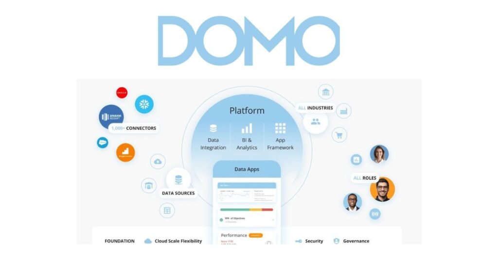
Domo is a cloud-based solution for data visualization and business intelligence designed for organizations looking for large-scale collaboration and advanced analytics. It ensures centralized access to company data by connecting with hundreds of data sources, including spreadsheets, databases, and cloud apps. Users may create personalized dashboards with its user-friendly drag-and-drop interface, and its mobile-friendly platform makes it accessible from anywhere at any time. In addition to visualization, Domo facilitates teamwork by allowing role-based access controls, sharing, and commenting. Domo is ideally suited for businesses that value real-time data-driven decision-making and seek a platform that combines analytics, collaboration, and business management capabilities because of its enterprise-grade scalability and security.
Plotly
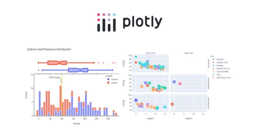
Plotly is an open-source graphing and visualization toolkit that enables analysts, data scientists, and developers to produce interactive visuals of publishing caliber. Plotly is well-liked by academics and developers due to its smooth integration with AI and machine learning processes. Dash, a web application framework for creating interactive analytical apps with no coding, is its most important attribute. From simple bar and line graphs to advanced 3D and geographic maps, Plotly offers a large range of chart formats. Plotly is perfect for professionals looking for highly customized and technically advanced visualization solutions because of its open-source flexibility, interaction with Jupyter Notebooks, and enterprise-level possibilities.
Chart.js
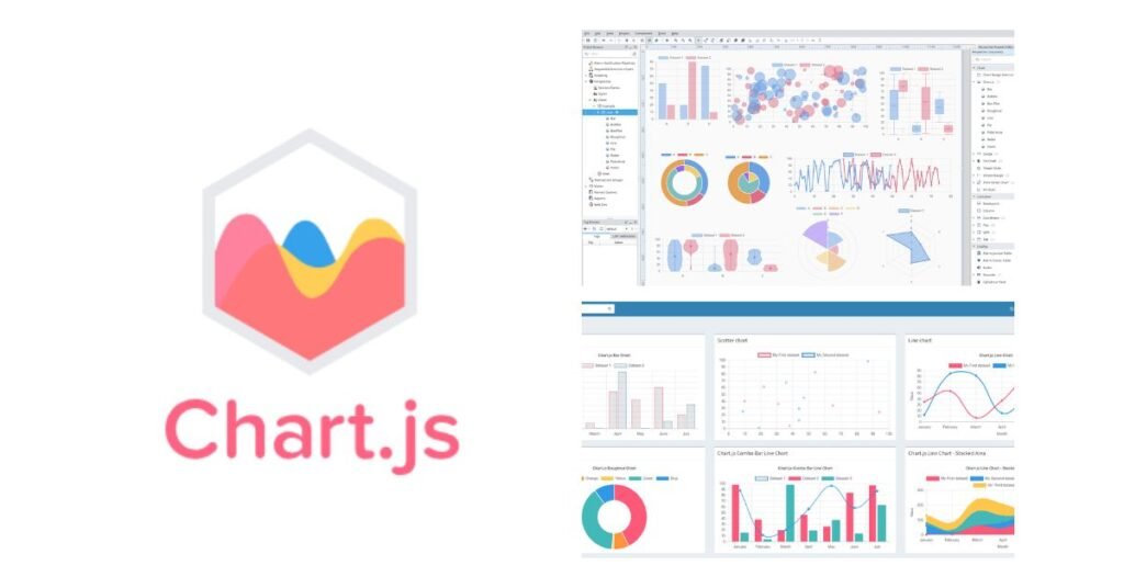
A small, open-source JavaScript package called Chart.js is used to make responsive and eye-catching charts. It is well-known for being easy to use and is perfect for developers who need to quickly incorporate interactive charts into apps or websites. Bar, line, radar, pie, and bubble charts are just a few of the many chart kinds that Chart.js provides. You can add animations, colors, and tooltips to any of these charts. Because it is open-source, it has the advantages of a robust community and frequent upgrades.Chart.js is frequently used for web-based projects that utilize dynamic, lightweight, and readily maintainable visualizations since it integrates smoothly with modern web technologies
Conclusion
Effective data visualization is the key to decision-making in the future. Choosing the appropriate tool can have a big impact on a company’s capacity to recognize opportunities, lower risks, and adapt in light of the data-driven strategies’ explosive rise. Organizations’ use of tools like Tableau, Power BI, QlikView, and Google Data Studio is transforming the way they share information. Lightweight solutions make it easy for newcomers to get started, while businesses gain from advanced data analysis and integration features. Smarter, quicker, and more strategic decisions are made possible with the proper visualization platform, which turns unstructured data into compelling stories. Success ultimately lies in matching tool selection to long-term growth objectives, user expertise, and business demands.
FAQ’s
What is the best data visualization tool for beginners?
Chart.js and Google Data Studio are two of the greatest options for beginners. Free and cloud-based, Google Data Studio easily connects with Google services like BigQuery, Analytics, and Ads. It makes it possible for non-technical users to design expert dashboards without knowing any code. In contrast, Chart.js is open-source, lightweight, and perfect for developers who wish to build straightforward yet eye-catching charts into apps or websites. Both tools are great places for learners to start because they strike a mix between simplicity and functionality. As their abilities develop, beginners might concentrate on understanding data presentation while progressively examining more complex characteristics.
What are the advantages of using tools for data visualization?
Tools for data visualization provide professionals and enterprises a number of important advantages. They make it simpler to identify trends, patterns, and abnormalities by converting unprocessed, complicated statistics into understandable graphics like charts, graphs, and dashboards. These tools facilitate accurate and timely decision-making by simplifying the interpretation of data. In order to increase productivity and teamwork, several platforms also enable real-time analysis, communication, and software integration. Beyond statistics, visualization improves storytelling by making information interesting and simple enough for both technical and non-technical audiences to understand. In the end, these tools enable businesses to make data-driven, well-informed decisions that spur expansion and creativity.
How can someone pick the most suitable tool for my company?
Budget, integration, technical know-how, and business goals all play a role in selecting the most suitable visualization tool. Free or inexpensive solutions like Google Data Studio or Chart.js, which offer important visualization without requiring a significant financial commitment, may be advantageous to startups or small enterprises. Because Power BI and Tableau offer modeling of predictions, AI integration, and scalability, they may be preferred by medium-sized to big enterprises that need advanced analytics and collaboration. Plotly and D3.js are excellent options if technological adaptability and customization are top concerns. In the end, the ideal solution should support your company’s goals, work in sync with current systems, and enable users to convert unprocessed data into useful plans.